The Jersey Thread (official)

jamesgould

Danny 'Bedsy' Buderus
Staff member
Admin
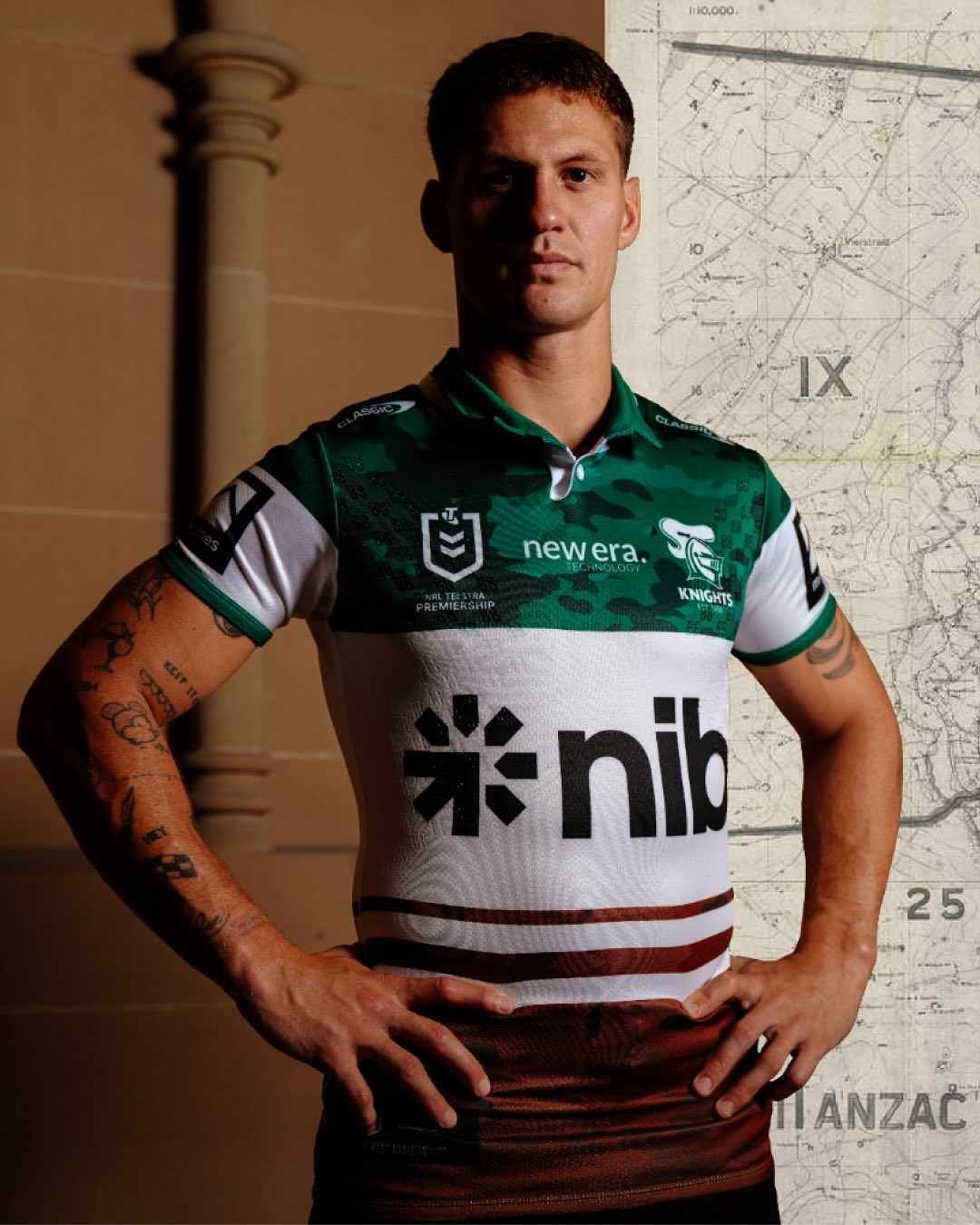
The ANZAC jersey deserves its own thread, and we could probably do with a thread where we post new jerseys or any little change in sponsors or anything.

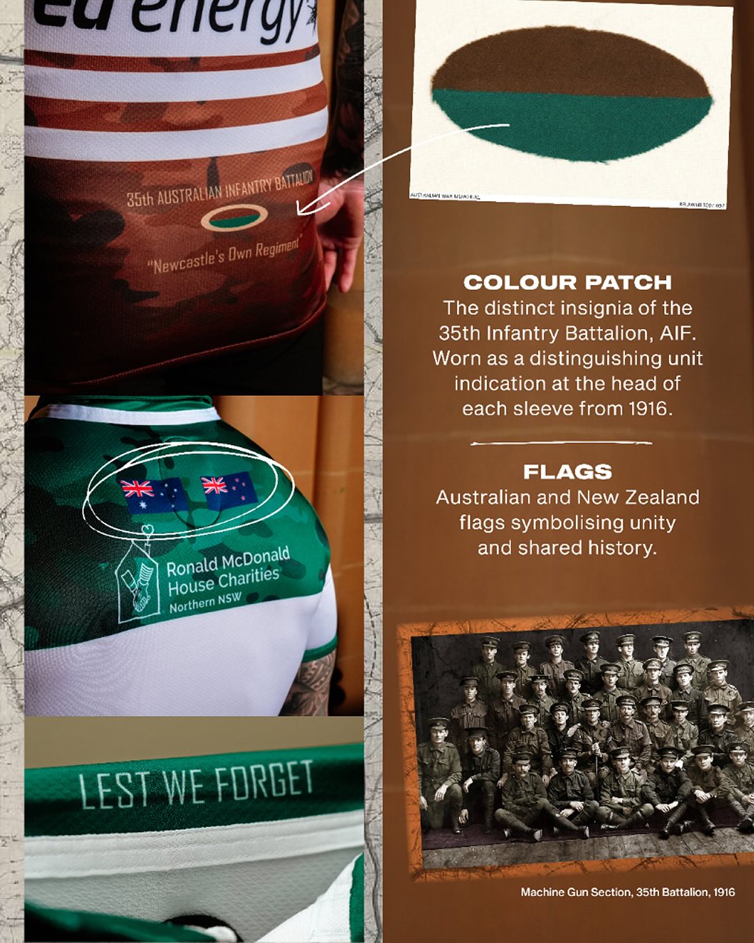
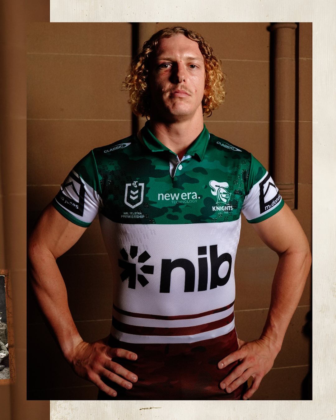
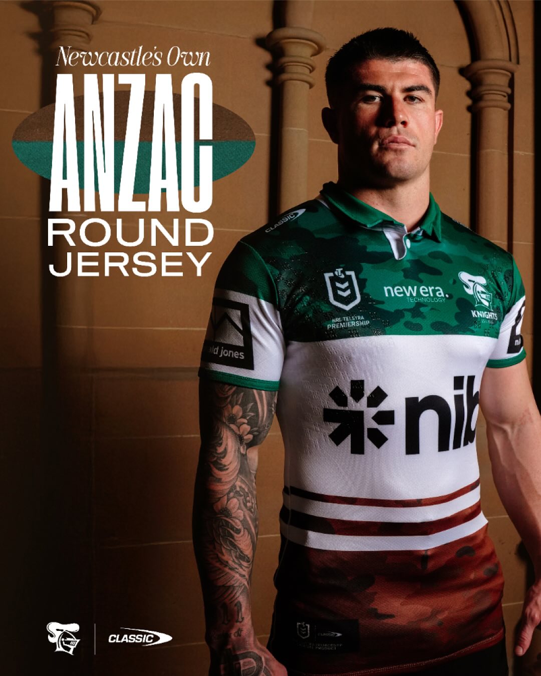
Thoughts on this? One interesting thing to note is nib doesn't have the huge block of green behind it! If only they'd compromise like this on our home jersey ...
489849710_18497138470014597_49819013285658291_n.jpg
489026916_18497138479014597_2398012152105278019_n.jpg
489691194_18497138488014597_6963106698346497101_n.jpg
488792887_18497138503014597_4027381261133635800_n.jpg
489067079_18497138506014597_2278178941116541418_n.jpg
 
It's upside down.
The colours of the 35th battalion had green on the bottom to show they were a NSW battalion and brown on the top to show they were the 3rd Battalion of the 9th division.

Little known fact - they were the first battalion who didn't do basic training in Sydney. They were housed in tents on Newcastle showground and would have done their drills on the open fields of "district park" - which is the land where EAS and the centre of excellence are now.
 
Big fan, would love if it came in a retro jersey style 3/4 sleeve too!
dont get the hate for NIB. at least we dont struggle to get a front of shirt sponsor.
 
It’s a particularly special one for myself. My pop was a 16 year old kid who grew up on the far south coast of NSW and wanted to test his metal as a man. Up for an adventure, make some money, get in the fight and maybe even meet some girls. (Obviously didn’t know what he was in for as so many other young men.)

He made the trek to Dubbo which was no mean feat and somehow convinced the recruiter to take him on. He ended up in a brigade a little lite on stocks and just so happened to be Newcastles own. Im
So proud and emotional around this move.

When my Grandfather who was a Kincumber boy met my pop and learned who he fought with it was a real fanboy moment for him. He served in the army between wars as he was just a bit too young to fight but obviously grew up and learned the history of his areas battalion.

Quite touched that the Knights have honoured all the young men who gave so much.

IMG_1875.jpeg
 
That’s probably going to be the heritage jersey.

You can release a new one every two years so it would coincide with the 30th anniversary of the first premiership.
 
That’s probably going to be the heritage jersey.

You can release a new one every two years so it would coincide with the 30th anniversary of the first premiership.
Not so sure itl be heritage, few of their posts have shown the vertical away jersey aswell. I think we may see both a new home and away jersey.
 
A welcome change for mine. I did like the current home jersey but happy to see a new coat of paint to go with the other changes after the stench of the last few years. Think this is our most timeless design overall (especially the away jersey). New ideas can be good, but historically they haven’t been when it comes to Knights jerseys.
 
When did we last have a genuinely new design, was it the bra jersey back in 2011? I’d have liked to see something new, all these classic jerseys have been tainted by wooden spoons, now. And the way we just rotate through them makes it hard to even remember which one we’ve had at what time.
 
I love the home jersey, it is our first premiership winning jersey and a tangible link back to our glory days.

I can’t say I like the away jersey but it’s very difficult to make it look good once you have white to it.
 
Does this mean this is our jersey in 2027? Are the vertical stripes the ‘nod’ to 97?

Anyway, don’t mind the home. If I’m nitpicking, I don’t love the red from our logo blending into the red panel. Logo looks great on the white panel. Gets a bit lost in the red. Perhaps a white outline around it could help it pop a bit.


NIB better be paying us a lot of money to stick with that green logo. I guess it stands out - a win for them. I thought it was compulsory NIB branding until I saw different colours on other teams jerseys.

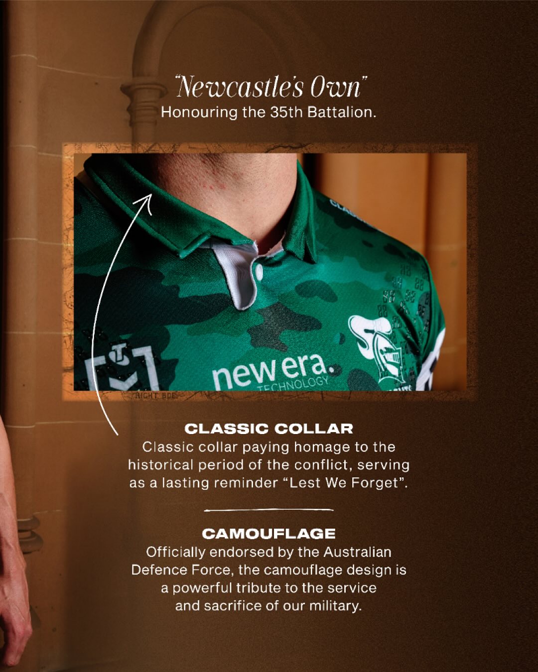
I wouldn’t mind seeing us rock that ANZAC jersey as our away. Emerald and cinnamon the traditional colours of Newcastle. It’s white base, and looks sophisticated.
 
Does this mean this is our jersey in 2027? Are the vertical stripes the ‘nod’ to 97?

Anyway, don’t mind the home. If I’m nitpicking, I don’t love the red from our logo blending into the red panel. Logo looks great on the white panel. Gets a bit lost in the red. Perhaps a white outline around it could help it pop a bit.


NIB better be paying us a lot of money to stick with that green logo. I guess it stands out - a win for them. I thought it was compulsory NIB branding until I saw different colours on other teams jerseys.

I wouldn’t mind seeing us rock that ANZAC jersey as our away. Emerald and cinnamon the traditional colours of Newcastle. It’s white base, and looks sophisticated.
I don't think I will every be capable of getting past the Green logo background, it's just too jarring.

The logo was integrated so well in the ANZAC jersey without the use of Green bubble - even though it looks like we had to upsize the logo as a concession I would much prefer a massive NIB logo without the Green backdrop.
 
When did we last have a genuinely new design, was it the bra jersey back in 2011? I’d have liked to see something new, all these classic jerseys have been tainted by wooden spoons, now. And the way we just rotate through them makes it hard to even remember which one we’ve had at what time.

Completely agree....getting bored with the jerseys, especially the vertical stripes.
 
Back
Top