danknights
Danny 'Bedsy' Buderus
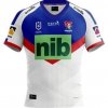
Put your glasses back on!I really like the new jersey and the model is nice to look at as well!


Put your glasses back on!I really like the new jersey and the model is nice to look at as well!
Which comments are you referring too?Yeah I prefer that nib logo too. A bit less in your face.
Caitlan Johnston looks fine wearing it too, don’t really know what that has to do with anything. Don’t think make players wearing a new jersey would get those comments.
That's not the new jersey mate.I really like the new jersey and the model is nice to look at as well!
It was part of Lachys contract negotiationWhy does the NIB logo have to be so high ??

for a million a year they can put a **** and balls on the jersey for all i care.I like both jerseys except for the nib logo. The nib logo spoils both jerseys.
This honestly looked like it required zero effort to create