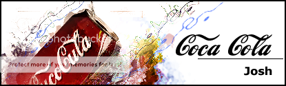
haha that's such a bad image. Will be hard to make a decent sig with that. I'll give it a shot though. If it doesn't look good I'll try find another Gidley image
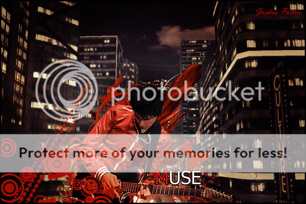
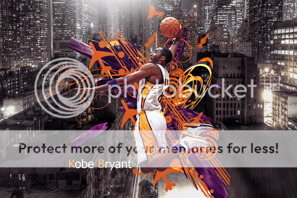
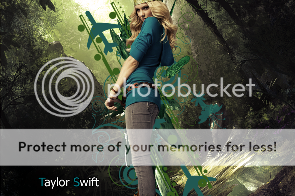
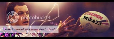
Goodjob on the wallpapers, but there is still a lot you can do on them.
Right now they just look like one layer on top of another (You can obviously tell there is just a background layer, a few textures or brushes, then the render on top).
Try blending everything in more, use more textures set on colour dodge or something, and some lighting. Mix it up a bit.
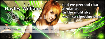
I know about text tuts but there's so many different ways and I just suck at them. Most the time I don't want to add text because these days it's just used to label things. Text isn't neccesary so yeah. I will try to get better at it though. I need to.


")